A tool to read color, not to choose it
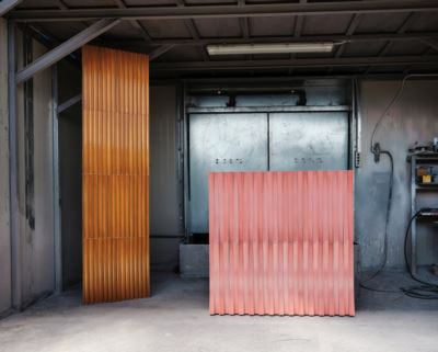
Ranieri’s Color Library is not a color chart, nor a ready-made palette. It is a guide designed to help understand how color behaves when interacting with a living, irregular material like lava. Each color is born from a specific combination of material, glaze, temperature, and time. For this reason, it does not represent an absolute value, but rather a possible condition.
Color as reaction
On lava, color is not applied. During firing, the glaze reacts with the surface, fuses with the material, and follows its tensions.
This process inevitably generates tonal shifts, variations in depth, and reflections—even within the same color. The Color Library is not meant to guarantee identical outcomes, but to illustrate chromatic direction, intensity, and the true character of color in action.
Variation as language
Lava is not a neutral base. Each slab reacts differently to the glazing process, and the color responds accordingly. Micro-variations, glaze movement, and perceptual differences are not flaws to be corrected, but visible traces of an authentic process. They are part of the Ranieri language. For this reason, the colors in the Color Library should not be read as definitive samples, but as living references.
Color and surface are inseparable
Color never exists on its own. Its behavior changes according to surface, finish, format, and context of use. The Color Library must always be read in relation to Ranieri’s surfaces and the specific project in which the color will be applied. A conscious chromatic choice emerges from the interaction of matter, light, scale, and function.
From reference to project
The Color Library is a starting point, not an end. Each project requires dedicated testing through specific samples and direct dialogue with the Ranieri team, to ensure consistency between chromatic intent, chosen surface, and final application. Choosing a Ranieri color means accepting a relationship with the material—not imposing a result.
A different idea of color
For Ranieri, color is not meant to cover lava, but to make its complexity legible. It does not flatten, simplify, or neutralize. It is an expressive tool that works with the material, embracing its limits and transforming them into visual depth.
